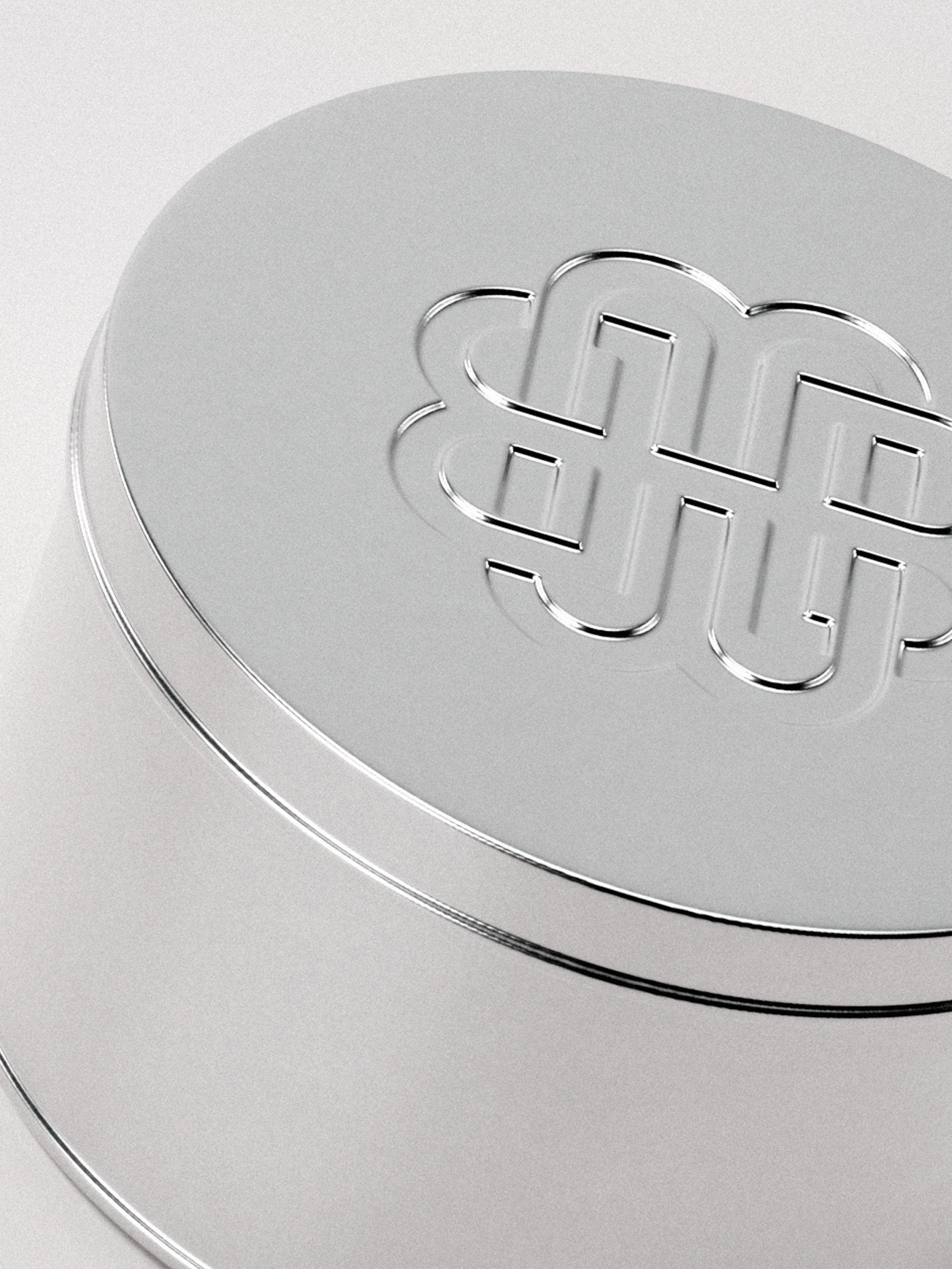
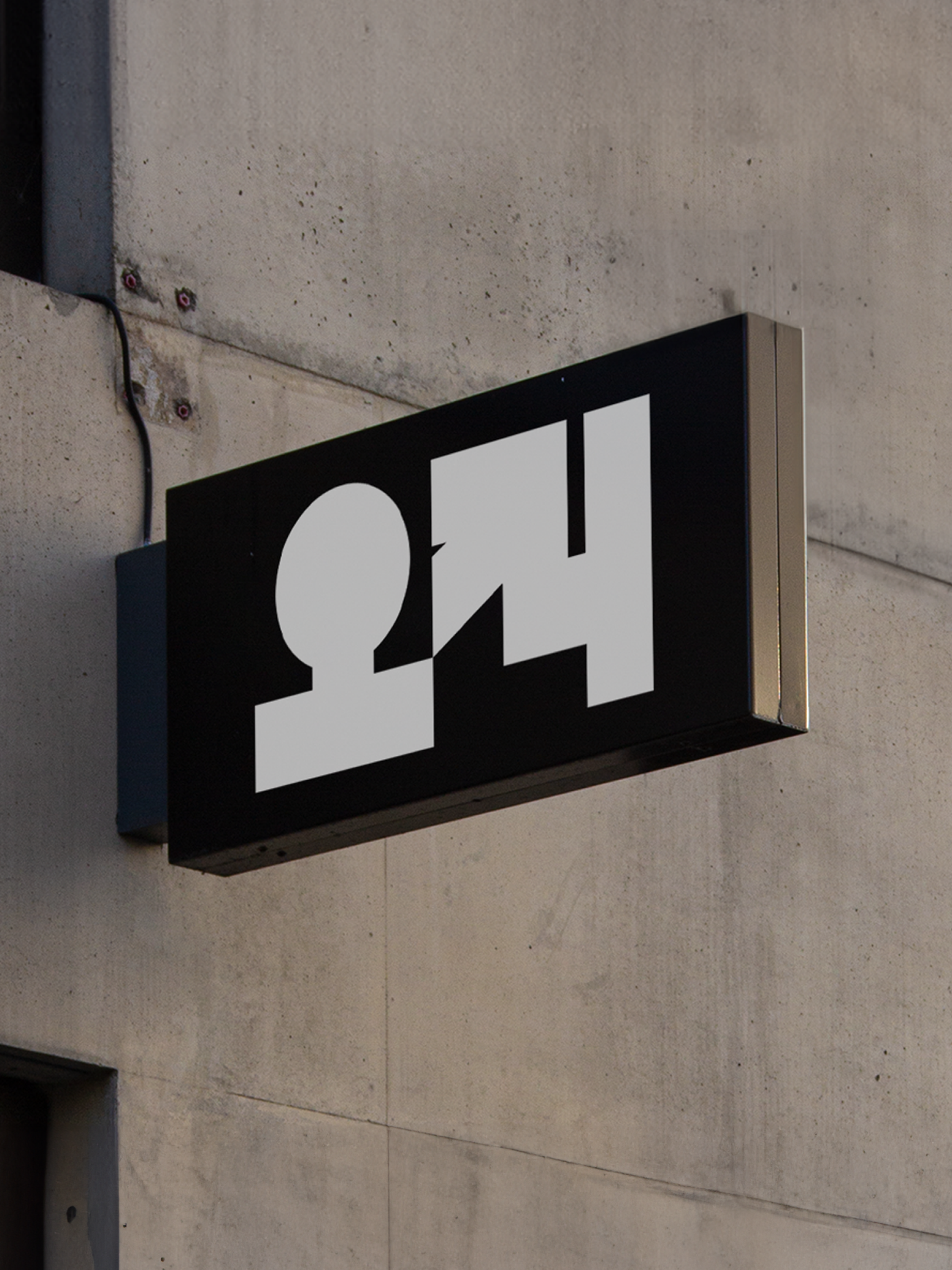
The visual identity for Mobon, an association of Korean traditional medicine doctors, was inspired by Korean patterns and the lotus flower motif. The logo seamlessly combines the initials "m" and "b" in Mobon, reflecting elegance and tradition. Packaging design and photo direction were developed to bridge the gap between heritage and modernity, contrasting traditional Korean aesthetics with contemporary pharmaceutical design.
Category
Role
ClientBranding, Package Design
Designer (logo, layouts, packaging, art direction)
Osungdang Global